Haris – Midterm

The Digital Milky Way

Concept

When thinking about the midterm project I was trying to come up with a design that would be both enjoyable to build and beautiful for the viewers to experience. Something that has always fascinated me with both intrigue and beauty is the space, endless galaxies, start, planets… So my goal was to recrate some of that in p5 and try to make an artwork out of it.

I had also worked on space design for my previous assignments and found that those were the assignments I enjoyed working on the most and the ones that in my opinion turned out the most beautiful so the decision was obvious and quickly made.

Like many other projects of mine I didn’t want the user to be just a viewer. I wanted everyone to be able to experience the artwork by interacting with it. So besides adding the 3 modes that can be accessed with pressing numbers 1,2 and 3 on the keyboard I also implemented a click function which pushed away the particles creating interactive art.

The three modes

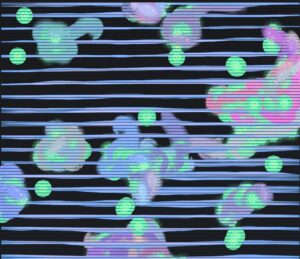
The project is divided into 3 different states all showing another beautiful part of space.

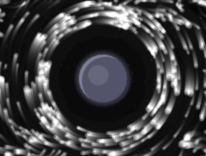
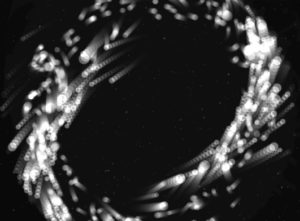
1. Planet with a ring

The first mode is inspired by Saturn which is known for its beautiful ring that circles it. It is also inspired by  my previous work where all my planets had rings. I think this brings depth to the planets and makes them more than just colored circles on the screen. For the ring I decided to integrate a particle system that we have been using in class which did make the project look way better, but also did give my laptop some troubles which I will talk more about later.
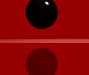
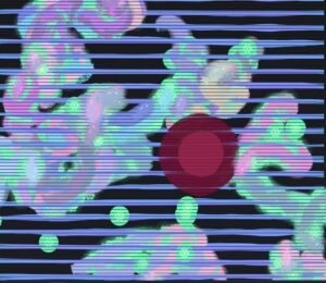
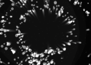
2. Black hole

The second mode of the project takes us into the fascinating world of black holes. To be more precise, the second mode gives the user the ability of the black hole at their fingertips, or should I say, mouse pointer. The particles are now start being dragged into the black hole as the planet disappears outside of the users view.

2.1 Black hole “sub-mode” (It’s not a bug its a feature!) 

When testing and implementing all the different modes I discovered something very interesting. If, during the 2nd mode, the user puts their mouse in the middle and lets the particles come together and then quickly removes the mouse it makes the particles explode in different directions creating a beautiful scene. I decided to leave the bug and use it as a feature in the design.
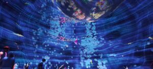
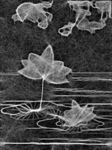
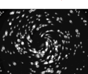
3. Galaxy

The third and final mode is the galaxy mode. Inspired by our galaxy, The Milky Way, it is supposed to represent the beautiful formation of galaxies in and outside of our observable universe. Particles are the main theme of this mode as they create a loop like shape that simulates galaxies. But since I felt that this mode could have some extra interactivity I implemented the click mechanic that pushes particles away.

I believe all the modes turned out how I wanted them to be and one of my favorite things to do is switch between modes and watch how the particles react to the different states they are given and I hope the users will enjoy them too.

Milestones

The road from the blank canvas to the finished product was a fun one but it did bring some challenges along the way. In the following passage I will try to explain some of the systems implemented in the project and how they work as well as walk you through some challenges I faced and what I did to overcome them.

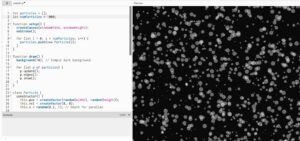
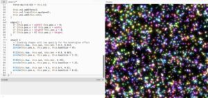
From the start of the project I knew I was going to work with the particle system and guided by previous experience from class where my laptop kind of struggled to run the basic particle system I knew I was in for a ride. But to make my life easier, before implementing the particle system using textures and WEBGL I decided to create them with simple dots that my laptop would be able to run and which I could later replace for particles.

This turned out to be a great idea as it helped me develop the logic without making my laptop work too hard so I could focus on the logic more than worrying about performance.

Orbit mode

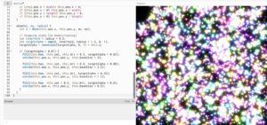
The orbit mode was used as a base for the whole project. Essentially, I wanted to simulate a static planetary system where all objects moved in a predetermined circular pattern. Instead of coding circular motion, I wanted to implement a combination of forces to simulate such a system.

Each particle is assigned a target radius, which determines the ring it belongs to. These radii are grouped into bands to create multiple layers of rings:

let targetR =
  band < 0.60 ? random(115, 170) :
  band < 0.90 ? random(185, 245) :
                random(265, 335);

There are also multiple forces that act on the particles to create the orbit effect.

Gravity like attraction:

let grav = toCenter.copy().mult(0.14 * planet.massScale / (1 + d * 0.006));

Tangential force:

let tangential = createVector(-toCenter.y, toCenter.x);
tangential.mult(0.22 * planet.spin);

Spring force:

let err = d - p.targetR;
let spring = toCenter.copy().mult(err * 0.008);

Together all of these help create the ring like structure we see on the screen.

Galaxy mode

One of the most important design decisions was to re-seed particle positions when switching to galaxy mode:

initGalaxy();

Instead of placing particles in discrete rings, they are distributed in a dense radial disk, with higher concentration near the center:

let diskR = 18 + (-log(1 - u)) * 60;

Also a characteristic of galaxies is the fact that particles closer to the center rotate faster than those further away. I implemented this using:

let orbit = 1.0 / sqrt(r * 0.85)

Thankfully I didn’t have any major challenges other than my laptops performance and the rest of the project went smoothly. I had to increase the pixel density when I was saving the photos but since my laptop struggles so much to run it I returned it to 1 so I could actually watch my project.

Video documentation

Video showcasing the interaction withing the project:

Final sketch

Reflection and Future Improvements

Working on this project was very fun and scary at the same time. It was fun to get to implement things that we have worked on in previous classes and to bring everything together into one project, but it was scary to think about everything that could go wrong on such big project and to have to worry about laptop performance holding me back.  But overall I am very happy with how the project turned out and am excited for others to experience it also.

As for the future improvements I would definitely love to play with colors and add more planets and different galaxies to the project. I would also maybe explore implementation of sound in some way but am not sure what kind at this moment.

Assignment 7 : Yash

Recreating the Void: teamLab Phenomena

Concept & Inspiration

We were tasked with selecting an installation that resonated with us and recreating its core aesthetic and interactive mechanics using p5.js.

I was immediately drawn to a specific room featuring a massive, heavy-looking dark sphere suspended in an intensely illuminated, blood-red space. Drawing on my background in film, I was captivated by the cinematic tension of the lighting. The stark contrast between the vibrant red environment and the pitch-black, light-absorbing object created a deeply imposing atmosphere. My goal was to translate that physical, heavy presence into a digital WebGL space, making the object feel tangible and reactive.

P5.js Sketch


The final sketch places the user inside a contained 3D room. At the center is a thick, glossy black cylinder rotating on its edge, constantly drifting via Perlin noise. Rather than a static environment, the sketch utilizes dynamic lighting, a highly reflective “dark mirror” floor, and physics-based raycasting to allow the user to push the shape away from their specific point of view.


Code Highlight

One of the most interesting parts of the code to write was the 3D mouse interaction. Instead of just moving the object on a flat X/Y axis, I wanted the object to be pushed away from the camera’s exact perspective.

By subtracting the camera’s current 3D position from the shape’s position, we get a normalized vector. Depending on whether the user is just hovering or actively clicking, a different level of force is applied along that specific path to shove the object back into the 3D depth of the room.

// --- MOUSE HOVER AND CLICK INTERACTION ---
  // Convert mouse coords to WEBGL space
  let mx = mouseX - width / 2;
  let my = mouseY - height / 2;

  let d = dist(mx, my, shapePos.x, shapePos.y);

  if (d < radius + 20 && mouseX !== 0 && mouseY !== 0) {
    cursor('pointer'); // Hints to the user that this thing is clickable

    // Figure out which direction to push the shape (away from camera)
    let camPos = createVector(cam.eyeX, cam.eyeY, cam.eyeZ);
    let pushDirection = p5.Vector.sub(shapePos, camPos).normalize();

    // If clicking push it harder, otherwise just a gentle nudge on hover
    let pushForce = 0;
    if (mouseIsPressed) {
      pushForce = 250; // clicking = big push
    } else {
      pushForce = 80;  // just hovering = small push
    }

    baseTarget.add(p5.Vector.mult(pushDirection, pushForce));
  }
Milestones and Challenges

Milestone 1: Establishing the 3D Perspective and the “Dark Mirror” Illusion The very first major hurdle was moving from a flat 2D illusion to a true 3D space. Initially, looking straight at a red background with a split line felt too flat. I had to explicitly construct a “stage” with actual mathematical walls, a floor, and a ceiling using WebGL planes.

The biggest technical challenge within this milestone was faking the floor’s reflection. WebGL in vanilla p5.js doesn’t natively handle raytraced reflections. To solve this, I had to think about drawing order: I first drew a pure black version of the shape upside down underneath the floor coordinates. Then, I drew the floor on top of it using a slightly transparent, highly specular dark red material (fill(5, 0, 0, 220)). This allowed the inverted shape to bleed through, perfectly mimicking the glossy, dark mirror effect from the physical teamLab installation.

Reflection & Future Work

To make the digital installation feel as immersive as the physical one, I realized that visuals alone weren’t enough. I introduced a cinematic, low-frequency drone track (BGMUSIC.mp3) that begins looping the moment the user first interacts with the canvas. This heavy audio grounds the piece and gives the digital void a sense of physical scale.

I also focused heavily on non-verbal UI cues. To teach the user how to interact without writing instructions on the screen, I programmed the mouse cursor to dynamically change: a pointing finger when hovering over the object, an open hand when looking around, and a closed grabbing hand when dragging the camera. Furthermore, the sketch auto-pans upon loading, proving the space is 3D before handing control over to the user.

For future work, I would love to tie the p5.Amplitude() of the background audio to the thickness of the shape, allowing the object to pulse and “breathe” in time with the low frequencies of the drone music.


Afra Binjerais – Assignment 7

Massless Suns and Dark Suns Recreated 

https://youtube.com/shorts/RYotOqlaMWA?feature=share

I chose this specific artwork because it’s the one that I felt the most confused about. I really like how small the room was compared to the other rooms in teamlab. I decided to recreate it but with a twist where the sky is dark instead and the rippling effect is circular. In the interaction itself the rippling effect as I remember it comes from waving but in my sketch it is just generated every 5 minutes. I decided to keep it simple and I really like how it turned out, 

A highlight of some code:

let dCenter = dist(s.x, s.y, width / 2, height / 2);

let dWave = abs(dCenter - waveRadius);

if (dWave < 55) {

  glowBoost = map(dWave, 0, 55, 2.6, 1);

}

I’m most proud of this part of the code because it controls how the glowing wave interacts with the stars in a natural and visually pleasing way. Instead of simply turning stars on and off, I calculate the distance between each star and the expanding wave, which allows the glow to change smoothly as the wave passes. This creates a soft ripple effect rather than something harsh or mechanical.

Sketch

Milestones and challenges in process:

I started with a very simple star field where all the stars were randomly placed across the canvas. While this worked, it felt messy and unintentional, so I moved to a more structured layout using a grid. After that, I introduced slight randomness in position, size, and glow to make the stars feel more natural instead of perfectly uniform. A key milestone was adding the wave interaction, where every few seconds a ripple passes through the stars and makes them glow. This helped bring the piece to life and added a sense of timing and rhythm. One of the main challenges I faced was making the wave feel smooth and natural instead of harsh or mechanical. I had to experiment with distance calculations and mapping values so that the glow would transition gradually rather than suddenly.

This assignment didnt have many milestones but this is the previous experimentation sketch:

Reflection and ideas for future work or improvements

 Overall, the sketch creates a calm and atmospheric experience, especially with the subtle glow and wave effect. I like how the stars feel balanced but still slightly natural rather than perfectly uniform. In the future, I would like to add more variation, such as a few brighter or larger stars, and experiment with different types of waves or subtle color changes to make the piece more dynamic and immersive.


Haris – Assignment 7

Inspiration

The inspiration for this project comes from Team Lab’s Graffiti Nature and Beating Earth from Team Lab Phenomena Abu Dhabi. I was inspired by the fact that the installation uses digital ecosystems to create something that feels alive, immersive, and responsive to human presence. The creatures within the installation are soft, glowing, and constantly moving, while the environment does not necessarily feel like an animation, but rather something that feels alive and responds to the things that are happening within it.

This does not simply show moving creatures and plants within an environment; rather, it feels like an entire ecosystem that incorporates life, growth, and death. This became the basis of my project and the reason I choose this visual.

My twist

My initial twist was to introduce the idea of healing versus pollution. While the original project centers on a living, breathing ecosystem, I wanted to take it a step further to highlight the effect of human intervention on such an ecosystem.

In my sketch, I wanted to provide the user with some power. Glowing flower-like seeds, spawn around the canvas and serve as an energy source for the fish. The user also has the power to spawn flowers on click which gives the user a constant choice between helping and damaging the environment. This would enable the fish to thrive and reproduce. On the other hand, I wanted to provide the user with another power: to introduce pollution blobs to the environment. The fish would start avoiding the place of pollution simulating real life where our pollution and wrongdoing force away the creatures, or in this example fish, from their natural habitat. This twist provided more depth to the project. Instead of simply recreating an animated ecosystem, I was able to transform it into a system where the user was responsible for creating a world.

Process

At first I started with the simplest step, the background. I noticed that in the Team Lab space the background had subtle lines that would give the space more depth and maybe try to simulate being under water.

This was done just by using simple lines and playing withe the color and placement. Once I was happy with the background it was time to go onto more exciting stuff and that was adding the fish. At first I was a bit scared of tackling this task as I was afraid simple design would make the project look too bland so I decided to add some glow effect and transparency as well as adding a subtle trail behind the fish to make the project look like a real time piece of art.

After the fish were done it was time for the final steps of adding the seeds spawning and the ability for the user to spawn pollution.

Code I am proud of

One part of the code I am particularly proud of is the logic that allows the fish to detect and move toward the nearest seed. I like this section because it makes the creatures feel more alive and intentional. Instead of moving randomly across the screen, the fish respond to the environment by seeking out glowing seeds, which helps create the feeling of a living digital ecosystem.

// attracted to healthy seeds
let closestSeed = null;
let closestSeedDist = Infinity;

for (let s of seeds) {
  if (!s.healing) continue;
  let d = dist(this.pos.x, this.pos.y, s.pos.x, s.pos.y);
  if (d < closestSeedDist) {
    closestSeedDist = d;
    closestSeed = s;
  }
}

if (closestSeed && closestSeedDist < 180) {
  let desired = p5.Vector.sub(closestSeed.pos, this.pos);
  desired.setMag(0.12);
  this.applyForce(desired);
}

This simple implementation makes the world feel so much more alive and brings my recreation much closer to the original Team Lab project.

Future improvements

I am already really happy with the final result, but if I was to add anything new it would probably be the explosion mechanism that the Team Lab uses. This would be a fun implementation and I could probably use the particle system that we learned in class how to use, but because of the timeframe I decided not to include that in the current state of the project. Overall I am happy with the final result and have learned that recreating someone else’s work with a twist is actually an amazing way to learn and practice p5.

Afra Binjerais- Midterm Project

StarryNight Reimagined. 

Project Overview

This project was inspired by The Starry Night and the visual qualities of the night sky, but reimagined in a different emotional context. Instead of a calm and dreamy atmosphere, I explored how the sky might look if it expressed anger. The project merges environment and emotion into a single visual system.

The design and intention developed throughout the process rather than being fully planned from the beginning. As I experimented, the idea of intensity became central, which led me to use a red color palette and a more minimal, abstract visual style.

Milestones:

  1. This was my initial experiment from the proposal stage. It was simple, but it marked the starting point of my idea:

  1. Here, I was experimenting with creating a background similar to The Starry Night, but I wasn’t satisfied with the result:

  1. In this video, I started exploring intensity and motion more deeply. This is where the main direction of my project began to form. I really liked the movement here and considered it close to my final outcome, but I felt that something was missing; which was color: 

https://youtu.be/OGdQaReItaI

  1. Final outcome: In the final version, I introduced color to represent intensity and emotion. I chose red because it strongly represents anger and energy, which aligns with the concept of the project

Video Documentation

https://youtu.be/PPoL7TNbMo4

Code snippet: 

let finalAngle =

noiseAngle +

wave * oscStrength +

swirlAngle * lerp(0.05, 0.22, e) +

(noise(time * 2.0, i * 0.1) - 0.5) * jitter;


let endX = startX + cos(finalAngle) * lineLength;

let endY = startY + sin(finalAngle) * lineLength;


line(startX, startY, endX, endY);

I am most proud of the part of my code where I calculate the final angle of each line using a combination of noise, oscillation, swirl, and subtle randomness. In this section, I am not relying on a single technique, but instead layering multiple systems together to create more complex and expressive motion. The noise provides an organic flow, the sine wave adds rhythmic movement, the swirl introduces a sense of direction around the center, and the jitter prevents the motion from feeling too predictable. By blending all of these into one angle, the lines feel alive and continuously evolving rather than static or repetitive. This part of the code reflects my understanding of key concepts from the course, especially noise, vectors, and oscillation, and shows how I can combine them creatively to produce a visually rich and emotionally responsive result.

Canva designing:

I used Canva to design the button because I wanted a customized visual element. This process was relatively simple, and I exported the design as a PNG and uploaded it into p5.js. 

link to design

Test printing:

Before the war, I contacted the inkjet printing team to test print my work and ensure the resolution was correct. I was able to partially test the print, and below is an image (not the best quality) of how it would have looked when printed.

Challenges: 

One of the main challenges I faced was controlling the balance between calm and chaotic motion in the flow field. At first, small changes in parameters like speed, noise scale, and oscillation made the animation feel too chaotic too quickly, which made it difficult to achieve a smooth transition using the slider. I had to experiment with different ranges and easing functions to slow down the beginning and make the buildup feel more gradual and intentional.

Reflection: 

Overall, I think the user experience of my project feels smooth and engaging, especially because the slider makes it easy to see how your input affects the visuals in real time. I like that the transition from calm to intense doesn’t feel sudden, but instead builds gradually, which makes it more satisfying to interact with. The motion and fading trails also help make the piece feel more alive and less static. At the same time, I feel like there’s still room to improve. Right now, the interaction is limited to just one slider, so in the future I’d like to add more controls, like changing colors, line thickness, or different motion styles, to make it more playful and customizable.

Link to drive for high resolution images: Afra Binjerais

Final Sketch

References:


Midterm : Yash

Awakening Padmini: A Digital Triptych of the Lotus

Core Concept and Design

Inspired by Raja Ravi Varma’s masterpiece, Padmini, the Lotus Lady, this project seeks to transcend the static nature of a two-dimensional canvas. Varma had a profound ability to breathe warmth, vitality, and soul into the lotus, making it a character as alive as the lady holding it. This interactive installation translates that historical mastery into the realm of creative coding.

Instead of a single fixed image, the lotus is reborn as a living, responsive digital entity. The core design philosophy revolves around metamorphosis, observing the same botanical subject through three distinct computational lenses. By moving from a hyper-stylized natural environment to autonomous agent simulations and finally into the raw data of kinetic typography, the installation explores the tension between biological reality and digital representation.


The Three Modes: A Metamorphosis

The installation is divided into three interactive states, each representing a different philosophical interpretation of life and code.

1. Sajīva (सजीव) — The Breathing Canvas

Sajīva translates to “endowed with life” or “living.” This mode is the most direct homage to traditional painting, heavily inspired by the atmospheric depth of Studio Ghibli. The lotus exists in a hazy, serene aquatic environment. It doesn’t just sit on the water; it breathes. Generative physics drive the gentle sway of the stems, the drifting of Ghibli-style clouds, and the delicate, random detachment of falling petals that float upon interacting with the water’s surface.

2. Prāṇa (प्राण) — The Ethereal Threads

Prāṇa represents the “vital life force” or “breath.” In this mode, the physical form of the lotus dissolves into pure energy. Using a swarm of 2,500 autonomous agents (boids), the sketch actively seeks out and traces the high-contrast edges of the previous scene. The boids act as digital spirits, constantly building and rebuilding the outline of the lotus in real-time. Eventually, the swarm scatters, representing the ephemeral and fleeting nature of organic life.

3. Māyā (माया) — The Digital Echo

Māyā translates to “illusion,” pointing to the concept that the physical world is a veil over deeper truths. Here, the visual reality of the lotus is stripped away entirely, replaced by kinetic typography. The image is reconstructed using the sheer brightness values (luma) of the original scene to dynamically scale the word “LOTUS.” It ebbs and flows on a sine wave, representing the underlying matrix of data that constitutes all digital art, a reminder that in this space, life is just an illusion painted by mathematics.

Implementation Details & Creative Process

The journey from a blank canvas to a complex, multi-state system required several distinct milestones, blending mathematical precision with artistic intuition.

Milestone 1: The Geometry of the Petal

The anatomy of the lotus was constructed entirely through code, avoiding external image files. This required a deep dive into bezierCurveTo() to sculpt the organic teardrop shapes of the petals.

  • Initial Draft: The first iteration focused purely on overlapping geometry and basic opacity, establishing the layered scale of the bloom.

  • Introducing Texture: To mimic natural biology, micro-veins were generated using radial loops, drawing harsh, distinct striations across the petal surfaces.

  • Refining Luminescence: The final petal geometry balanced the harsh lines with a soft, glowing base gradient (cBaseGlow = '#eaf0c0') and deep magenta tips, achieving the flush of life seen in traditional oil paintings.


Milestone 2: Environmental Rendering & Performance

To create Sajīva, an entire ecosystem needed to be rendered without tanking the frame rate. The solution was architectural: rendering complex assets (like the fractal noise clouds and radial gradients) into hidden, static createGraphics() buffers during the setup() phase. In the draw() loop, these pre-rendered sprites are simply mapped and manipulated, allowing the CPU to focus entirely on the generative falling petals and water ripples.

Milestone 3: The Boid Edge-Detection Algorithm

For Prāṇa, the challenge was teaching the boids where the lotus actually was. The system captures a hidden, high-resolution snapshot of the scene, converts it to grayscale, and runs a custom density-mapping algorithm to detect sharp contrast boundaries.

// A snippet of the edge-detection logic allowing boids to "see" the lotus
let diff = abs(val - valR) + abs(val - valD);
if (diff > 15 || val > 200) { 
  edgeValues[y * w + x] = 255; // Solid trackable line for boids
}


Physical Realization: CAT Lab Inkjet Prints

While the project thrives as a kinetic, interactive digital installation, exploring the theme of “Decoding Nature” required bringing the digital back into the tangible world. I had the opportunity to run high-resolution exports of the three modes through the inkjet printers at the CAT lab.

Translating the light-emitting RGB screen into physical CMYK ink drastically altered the texture of the work. The sweeping threads of the Prāṇa boid simulation translated beautifully onto the paper, looking akin to an intricate silver-point etching, while the rich magentas of the Sajīva lotus gained a velvet-like matte quality that echoed the traditional canvas of Ravi Varma.


Video Documentation

The video documentation captures the seamless transition between the three states of the triptych. It highlights the generative nature of the falling petals in Sajīva, the mesmerizing, real-time flocking assembly and dissolution of the Prāṇa mode, and the rhythmic, breathing wave of the ASCII characters in Māyā.


P5.js Sketch :

Reflection and Future Improvements

The current user experience thrives on the element of surprise—the spacebar transforms the world instantly, forcing the viewer to re-contextualize what they are looking at. The technical optimization (using off-screen buffers) was highly successful, allowing thousands of agents to run smoothly in the browser.

Future Iterations:

  • Audio Reactivity: Integrating the p5.sound library so that the boids in Prāṇa and the text waves in Māyā react to ambient noise or a live microphone input.

  • Interactive Fluid Dynamics: Allowing the user’s mouse to disrupt the water surface in Sajīva, creating custom ripples that the falling petals physically react to.

  • Physical Computing: Utilizing a microcontroller (like an Arduino) to switch scenes based on physical proximity sensors, making the installation truly immersive in a gallery space.

References

  1. Varma, Raja Ravi. Padmini, the Lotus Lady. (The primary artistic and thematic inspiration).

  2. McCarthy, Lauren, et al. p5.js. (The core creative coding framework).

  3. Perlin, Ken. Perlin Noise. (Utilized heavily for the organic generation of clouds and the natural sway of the lotus stems).

Assignment 7

Inspiration and Concept

I chose to recreate the butterfly installation because of the profound way it handles the cycle of life. In the exhibition, the butterflies seem to move slowly, almost suspended in the moment, but before you know it, they are gone. It is a reminder of how fleeting time is.

Interestingly, the butterflies in the exhibit are affected by human interaction. On approaching them, they seemed to diffuse and on touching the space they were projected onto, they would fall, as if we’d killed them. I  incorporated this interaction in my sketch as well.

My twist on the original visual is that the end of one life becomes the catalyst for another. When a butterfly “dies” (is clicked), instead of just disappearing, it falls to the earth and seeds a new, different, but equally beautiful life: a flower. To me, this represents the idea that contentment comes from accepting the changing nature of things. Even when a specific chapter ends, it provides the nutrients for something new to bloom.

Sketch

Butterflies emerge from the forest floor and drift upward.

Touch: Click a butterfly to end its flight. Watch it fall and reincarnate as a swaying flower (you might need to scroll to see the ground in this blogpost).

Interact: Move your mouse near the butterflies or flowers to see them glow brighter. The butterflies will gently shy away from your cursor.

Milestones & Challenges

The first goal was to get the butterflies moving from the bottom to the top. I used Perlin Noise to give them a natural, fluttery motion. However, I immediately hit a snag: the butterflies started accelerating aggressively toward the left or right edges of the canvas instead of staying on an upward path.

The Fix: I implemented a velocity limit and a constant “lift” force. This kept their speed under control while ensuring their primary direction remained vertical.

Next, I had to handle the transition from flying to falling. This required a State Machine within the Butterfly class. I added a state variable (FLYING or FALLING). When the mouse is clicked near a butterfly, its state flips, gravity is applied, and the “wing flap” oscillation slows down to simulate a loss of vitality.

The final stage was the “twist.” I created a Flower class that triggers at the exact x-coordinate where a butterfly hits the ground. I also added Sensory Logic:

  • Fleeing: Butterflies now calculate a repulsion vector from the mouse.

  • Proximity Glow: Using the dist() function, both butterflies and flowers “sense” the cursor and increase their transparency mapping (alpha) to glow brighter as you get closer.

Highlight

I am particularly proud of how the butterfly “seeds” the flower. To maintain the visual connection, I pass the specific hue of the butterfly to the new Flower object. This ensures that the life cycle feels continuous; the “soul” of the butterfly determines the color of the bloom.

// Inside the main draw loop
if (b.state === "FALLING" && b.pos.y > height - 25) {
  // We pass the butterfly's unique hue to the new flower
  flowers.push(new Flower(b.pos.x, b.hue)); 
  butterflies.splice(i, 1); // The butterfly is removed
}

Reflection

This assignment taught me how powerful Additive Color Mixing (layering semi-transparent shapes) is for recreating the feel of a light projection. By using the HSB color space, I was able to match the neon, ethereal palette of the teamLab forest. Some potential improvements:

  • Life Span: I’d like to make the flowers eventually fade away as well, completing the cycle and allowing the ground to remain “clean” for new growth.

  • Collision Detection: It would be interesting if butterflies had to navigate around the stems of the flowers that the user has created.

  • Soundscape: Adding a soft, shimmering sound effect when a butterfly transforms into a flower would deepen the emotional impact of the interaction.

Team lab recreation- Assignment 7

Picture of Inspiration

I chose a connecting corridor inside a teamLab installation. It is a transitional space, not a main artwork, which is exactly why it stood out to me. When you walk through it or touch the walls, the light disappears around you. It does not explode or react loudly. It just empties.

Why I Chose This Visual

What stayed with me was not the visuals themselves, but the behavior.

Most interactive works reward you. They give more when you touch them. More color, more movement, more feedback. This one does the opposite. It takes away. The space clears around your presence, almost like it is making room for you, or avoiding you.

That felt different. It felt quieter and slightly uncomfortable. You are not adding to the system, you are interrupting it.

I wanted to work with that idea. Not interaction as spectacle, but interaction as subtraction.

Code Production

I tried to recreate this logic using a particle system. The particles move continuously using noise, forming a kind of ambient field. When the user interacts, instead of attracting particles or creating brightness, the system creates a “void” that pushes particles away.

The goal was not to replicate the exact visual of teamLab, but to capture the feeling of space being cleared in response to presence.

One important part of the process was fixing how the system transitions between states. At first, the scene would abruptly reset when interaction stopped, which broke the illusion. It felt mechanical. I adjusted this by removing hard resets and introducing gradual transitions, so the system responds more like a continuous environment rather than a switch.

I also slightly increased the background fade during interaction so the space actually feels like it is dimming, not just rearranging.

My Twist

The original corridor is very minimal and almost silent in behavior.

My version exaggerates the system slightly. Instead of a clean empty space, the particles resist the user and leave behind traces of motion. The void is not perfectly clean. It is unstable and constantly reforming.

I also introduced layered particles with different sizes and brightness levels. This creates a glow effect that lingers, so the absence is never total. There is always a memory of what was there.

So instead of pure emptiness, my version becomes something closer to a shifting field that reacts, clears, and then slowly rebuilds itself.

Code I’m Proud Of

What I am most satisfied with is how I handled the transition between interaction and stillness.

Originally, I used a direct background reset:

background(0);

This caused the scene to snap instantly, which felt harsh and disconnected from the rest of the motion.

I replaced it with a gradual fade:

let targetFade = active ? 0.32 : 0.06;
fade = lerp(fade, targetFade, 0.08);

fill(0, 0, 0, fade);
rect(0, 0, width, height);

This small change made a big difference. The system now dims and recovers smoothly, which aligns better with the idea of a responsive environment rather than a binary state.

Embedded Sketch

Please view it in p5 itself, here its looking funny

Milestones and Challenges

The first step was simply getting something to move on the screen. I started by creating a “Particle” class. At this stage, I wasn’t worried about colors or glows; I just wanted to see if I could make 5,000 objects move without crashing the browser.I used a simple Particle object with a position and a velocity.

Now that the system was working, it needed to react to me. This milestone was about the “Control” half of my theme. I created a “void” around the mouse. I wrote a mathematical check: If the distance between a particle and my mouse is small, push the particle away.

The final version was about the transition. In the beginning, the lights snapped back instantly when I moved the mouse, which felt mechanical. I wanted it to feel like the system was “exhaling.” The Logic: I introduced lerp() (Linear Interpolation) to every state change.

Reflection

This project made me think more about interaction as something subtle. Not everything needs to respond loudly. There is something more interesting in systems that shift quietly or even withdraw.

I also realized that small technical decisions, like how a background is drawn, can completely change how the work feels. The difference between a reset and a fade is not just visual, it changes how the system is perceived.


Future Work

If I continue this, I want to push the idea of absence further.

One direction is to make the void linger longer, so the space remembers where the user was. Another is to introduce multiple interaction points, allowing different “voids” to overlap and interfere with each other.

I am also interested in connecting this to sound or vibration, so the clearing of space is not only visual but also sensory.

Right now, the system reacts. In the future, I want it to feel like it anticipates or resists.

Midterm- Islamic geometry

Project Overview

For this midterm I wanted to approach Islamic geometric ornament as a system rather than a style. Instead of drawing an 8-fold star, I reconstructed the {8,8,4} tiling that produces it. The star is not designed first. It emerges from a checkerboard of octagons and squares.

I was interested in exposing the structure behind something we often read as decorative. Girih patterns are precise, proportional, and rule-based. They are algorithmic long before computers existed. After reconstructing the grid mathematically, I introduced controlled oscillation. The geometry breathes. The valleys of the star expand and contract subtly, but the proportional relationships remain intact.

This project investigates:

• Ornament as system
• Pattern as consequence
• Tradition as computation
• Geometry as inheritance

The woven strapwork illusion is achieved through layered strokes only. There is no shading or depth simulation. The complexity comes from repetition and constraint.

Oscillation

The motion in the system is driven by a minimal oscillator that functions as a time engine. Rather than animating positions directly, I use a simple class that increments a time variable at a steady speed. This time value feeds into a sine function, which subtly modulates the inward valley radius of each tile.

Instead of having every tile move in perfect synchronization, I introduce phase offsets based on distance from the center. This causes the oscillation to ripple outward across the field. The pattern breathes, but it does not collapse. The proportional relationships remain intact. The system moves without losing structural stability.

The {8,8,4} Grid

The foundation of the project is the alternating tiling of octagons and squares, known as the {8,8,4} tiling. The grid is constructed as a checkerboard: when the sum of the tile indices is even, an octagon is placed; when it is odd, a square is placed.

The spacing of the grid is determined by the apothems of the octagon and square. These radii define the structural rhythm of the tiling and ensure that the shapes interlock precisely. Every star, intersection, and strapwork path derives from these underlying geometric relationships.

I included a toggle that reveals this hidden construction grid. Conceptually, this was important. I did not want the ornament to detach from its mathematical logic. The beauty of the pattern comes from its structure, and I wanted that structure to remain visible.

Strapwork Construction

Each tile generates strapwork by alternating between two radii: the midpoint radius and the inward valley radius.

The process is repetitive and rule-based. First, the path crosses the midpoint of a hidden polygon edge. Then it rotates halfway between edges and moves inward to form a valley. This sequence repeats around the polygon.

The 8-fold star is not explicitly drawn. It emerges from this alternating rhythm. The star is a consequence of structure, not a predefined graphic element.

The Weave Illusion

The woven ribbon effect is created through two drawing passes of the exact same geometry.

The first pass uses a thick black stroke to establish the structural band. The second pass uses a thinner white stroke on top of it. This layering creates the illusion of interlacing.

There is no masking, depth simulation, or z-index manipulation. The woven effect emerges purely from stroke layering. I wanted the illusion to remain structurally honest and consistent with the logic of the system.

Interface

The interface is intentionally minimal. It includes a morph slider, a thickness slider, a hidden grid toggle, and simple keyboard controls to pause or save the canvas.

The morph slider controls how deeply the valleys cut inward. At a value of 50, the star sits in a balanced classical configuration. Moving away from this midpoint exaggerates or compresses the geometry, revealing how sensitive the form is to proportional change.

The interface supports exploration, but it does not overpower the geometry. The system remains the focus.

Video Documentation

what I intended to print at the cat

Reflection

This project shifted how I understand Islamic ornament.The 8-fold star is not a symbol to be drawn. It is a structural outcome.Working through the math made me realize that the beauty of girih lies in constraint. The system is strict, but the visual outcomes feel expansive.

What works:
• Immediate feedback through sliders
• Conceptual clarity via grid toggle
• Subtle motion that remains architectural

What I would develop further:
• Introduce color logic tied to oscillation
• Allow zooming and panning
• Experiment with density variation
• Explore extrusion into 3D space

This project feels like the beginning of a larger investigation into computational ornament and inherited geometry.

References

Conceptual Influences
• Islamic girih tiling systems
• Archimedean {8,8,4} tiling
• Khatam geometric construction

Technical Resources
• p5.js documentation
• The Nature of Code-  Daniel Shiffman
• Trigonometric construction of regular polygons

AI Disclosure
AI tools were used to refine some code language when encountered functioning errors. All geometric logic and implementation were developed independently.